Thursday, February 18, 2010

El Anatsui

I usually refrain from writing about exhibitions I see in Chelsea, but yesterday's venture prompted me to thoughtfully put pen to paper.


In particular, Eli Anatsui's visually arresting show at Jack Shainman Gallery proved to be more an encompassing experience rather than a mere passive art exhibition. The Ghanaian artist's richly textured pieces, comprised of thousands of discarded bottle caps and twisted foil wine wrappers strung together with copper wires, vibrate with life and history. Rather than hung flat, the artist requests that they be draped on the walls at the gallery's discretion so that each piece can never be exhibited exactly quite the same way again. This organic quality of the pieces is further enhanced by the strong visual of the cloth-like works snaking sinuously across the gallery walls. Denouncing the geometric perfection of the space, they challengingly hang with jagged edges in some places, softly rounded corners in others.

The dominant use of reds and golds with punctuated areas of silver (revealing the underside of the aluminum wrapping) in Anatsui's fabric-like works are reminiscent of kente cloth, which is traditionally reserved for important family or community events. Through myriad combinations of patterns, designs and color, the cloth depicts specific details of a wearer's heritage, family, culture and role in the society. Anatsui has turned this revered tradition on its head by replacing cloth with found metal debris. The artist gathered these found discarded pieces in Nsukka, Nigeria, where the artist has lived and worked for the last 28 years. The magnitude of this task and the massive resultant metal "cloths" are pointedly a testament not to a culture or or individual's rich history but to, sadly, the Western infiltration of commercialism, consumer nature and a throw-away mentality.


Jack Shainman Gallery

513 West 20th Street, New York
February 11th-March 13th, 2010

Friday, January 15, 2010

Assessing Deaccessioning

In the wake of the National Academy Museum’s announcement to sell Frederic Edwin Church's Scene on the Magdalene (1854) and Sanford Robinson Gifford's Mt. Mansfield (1859) to cover operating expenses and Brandeis University’s decision last year to close its Rose Art Museum, this latest article in the NY Times sheds no more light on the issue than has countless articles in ARTnews and art blogs. Rather than reiterate what has already been stated, I offer a different approach.

While I mourn the possibility of many art institutions ultimately succumbing to economic strain and having under-recognized artwork (and artists) disappearing into private hands, it is time that these very same organizations reassess the role of art in society. True, dwindling endowments are the major reason behind these actions but if the arts were not explicitly catered toward an elite few, perhaps they would not be as devalued as they are today and that arts would not be dictated by endowments and corporations alone. With the wealth of artistic expression comes periods of enlightenment and with a resurgence of interest in the arts, people would rally to maintain it and its ever-decreasing government funding. With organizations like the NEA, Americans for the Arts and the Department of Cultural Affairs, the industry is definitely not ignored, but very much underserved compared to other avenues that are deemed significant. Yes, for all intents and purposes, our government is in gross debt, but that is because any funding for art and social issues is re-routed toward a grossly wasteful and inefficient military budget. I acknowledge that this view is naively simplistic and is far from addressing many of the gray areas, but my point is just that: optimistically simplistic. We must ask bigger questions than "If we allow selling of artwork, wouldn't it set a dangerous precedent?" (which I'd answer with a resounding No, as do many others) toward a question of how we can ensure that art does not sink any further down our misguided priorities.

Saturday, December 12, 2009

Almost

Almost, a tightly-curated show by Lance Goldsmith, joins seemingly disparate artists into a beautifully cohesive exhibition. Together, the works address concepts of suspension, balance, and the fragility of nature and process. The viewer is privy to all of these elements and are very much included as characters in relation to the pieces and the exhibition itself.


Josh Tonsfeldt's delicate pieces concentrate upon the fascinating beauty of natural forms. Taking spider webs from his family's abandoned horse barn, Tonsfeldt gently colors them red, blue and silver and places them on stark white sheets. Straw, dirt, remnants of a cigarette and bugs, and other small debris intermingle with the fragile netting. Instead of competing with each other, all of the individual elements meld into one, into a snapshot of decay and death. This is turned on its head as viewers lean in to examine the piece or traverse the gallery. Indeed, the piece adopts a life of its own as it shifts and contracts in response to movement - or even the merest breath.


Two Richard Tuttle Fiction Fish (1992) pieces were also included, complete with cardboard elements (including a toilet roll) and a pencil drawing of a line (or fish line) rising from the floor, up along the wall, and only stopping inches onto the ceiling. His cheeky works immediately make one question their relationship to the works, both physically and philosophically.


Jim Lee's charming works turn everything inside out, and outside in. His clever wall sculptures, one recalling Serra's Prop works, proudly show how each piece is constructed, from intentionally allowing glue to seep out, to using clear plexiglass to reveal the back of the work. Lee showcases not only fragility and impermanence, but allows us access to the process and form of its very existence.

Monday, September 28, 2009

Rachel Foullon: Grab a Root and Growl


Upon entering the cavernous gallery space, down a mere five steps from the gritty streets of the Lower East Side, Rachel Foullon's Grab a Root and Growl unceremoniously ushers you into a drastically different world. The title of the show itself references a common rallying cry for 1930's Dust Bowl farmers who refused to abandon their land, which had become barren and inhospitable. In her eight new wall sculptures, Foullon recalls these agrarian lifestyles and cycles of birth and death, as well as the symbiotic relationship between individuals, and between humans, animals, land and the architecture that houses and protects them.


The sewn canvas garments, from a men's nightshirt, a horse's hood, an apron, and a kerchief, are turned into and upon themselves, twisted and loosely knotted. The stiffened heavy canvas pieces are made airy, weightless and beautifully organic in their seductive folds and the painstaking sea-salted muted dyes of pale peach, bleached butter, distressed blues and one very vibrant red. The sea salt, a direct reference to the salts of the earth and of labor, of sweat and blood, are reflected in the laborious construction of each piece. Indeed, upon close inspection, one can see that the pieces of cloth are home-sewn, with halting, imperfect stitches that undoubtedly indicate the care taken with each contact between fabric and thread. The apron, the ultimate signifier of domesticity in the traditional household, is lovingly sewn with scalloped edges and a carefully hidden fabric rose appliqué.

In The Wrong Place, the Wrong Time, in a Sort of Rapture (2009), Foullon subtly transforms a plain red apron into an object of religious and social significance. As with the other pieces, it is anchored to the walls by a crosshatch of colored, hand-milled cedar. The apron, initially a mundane, functional tool, is almost Christ-like in its figuration and is swiftly made heady with meaning when turned upside down, rolled up and its waist ties stretched out across the cedar beams.

The beautifully mottled colors of the pieces play upon each other, pulling the viewer from piece to piece. The sea salt and muted colors of the works bring to mind beach-ridden debris that wash ashore, as they too are remnants of a personal and private history. However, their minimal nature is reminiscent of Richard Tuttle’s tendency for muted colors, basic materials and anti-aesthetic sensibility. Coupling hand-dyed and sewing techniques, it is evident that Foullon is a formalist by nature. Her pieces are a testament to a certain historic period and its people as much as process.


Nevertheless, the mesmerizing folds of the pieces urge the viewer to look closer and examine these people and how they lived. The canvas pieces hang as trophies or – more appropriately, monuments – and are embodiments of the enduring resilience and pride of the individuals, families and animals that remained undeterred by circumstance. The large, exaggerated - almost Oldenburgian - fabric forms are secured with large, oversized nails to hand-finished milled cedar that recall rural architecture from the early Dutch Hallenhaus barn to simple post-and-beam-constructed houses of the Dust Bowl. To offset the soft cloth sculptures, the cedar, colored in pearlescent turquoise, deep browns and stormy grays and blues, mimic wall drawings and the stark, harsh lines of abstraction and static minimalism. However, the work in the center of the gallery stores additional pieces of colored cedar, suggesting that the surrounding pieces can easily contract and expand. Foullon’s works are continuously in flux, much like the persistence of humankind and nature to evolve and, ultimately, to survive.


Nicelle Beauchene Gallery
163 Eldridge Street, LES
Through October 25th, 2009

Tuesday, August 4, 2009

Dark Spring, Dark Soul


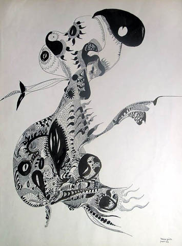
I have always been intrigued by the inherently raw nature and emotional purity of illustration, so I was thoroughly excited to visit the Drawing Center's Unica Zürn: Dark Spring exhibition. A German artist and writer, Unica Zürn (1916-1970) was raised in Weimar Berlin to a privileged family. Earning a living as first an editor and journalist, she married and bore two children, but lost her family when her husband was eventually granted custody after they divorced. In 1953, she began a tumultuous relationship with German Surrealist artist Hans Bellmer and joined him in Paris. There, she quickly became immersed within the Surrealist circle, which included Henri Michauxm who introduced Zürn to dangerous dabbling with mescaline and would ultimately lead to a series of mental breakdowns and struggles with schizophrenia until her suicide in 1970.


Grossly under-recognized within and beyond her lifetime, Zürn's beautifully intricate illustrations are a Surrealist's dream - a lyrical amalgamation of mythical creatures, disembodied faces, curiously inquisitive floating eyes, peculiar amoeba-like organisms and bizarre plant life. These fantastical ecosystems are a product of automatism and pure intuition; a manifestation of her troubled psyche, her drawings are a play between a lulling, haunting dream and a reckless imagination on the cusp on madness. One can imagine a direct link between mind and medium, where these cluttered images spilled onto the paper without hesitation, apology and rationale.

At once soothing and disturbing, her seemingly chaotic works evoke not horror but a churning, shifting state of emotional, physical and mental anguish. Here, all is possible as birds merge into fish, fossil-like imprints fan out over disfigured faces, scaly swirls enclose curious creatures that, instead of struggling their way out, seem to meld and conform to their capture. In fact, upon closer viewing, these incongruous figures and creatures are not a random hodgepodge of images, but seem content to float about together in a cohesive mass to melancholic effect. However, the disparate elements do not seem to interact with another, but merely peacefully co-exist. This contrasting tension is further demonstrated by the strong, smooth, organic lines of her work, which are neither jagged or rough to suggest her fragile, agitated state. Instead, the harmonious lines curve, circle and converge on the surface. Despite the apparent chaos of her work, perhaps Zürn's works are not a literal reflection of her deteriorating mental state but an invitation to an imagined, whimsical reality to escape her inevitable decline.


Zürn was also known for her writings, including Hexentexte (1954), a book of anagrams, Sombre Spring (1969) and Jasmine Man (1971). The show also included writings, including letters she had written to Bellmer and Man Ray. Her scrawled notes offered further insight into her disturbed psyche and acted as a narrative for her work. It seems impossible to fully grasp the tortured thoughts that used such illogical images as vehicles of expression. But through our own frailties, we can certainly appreciate them. Indeed, instead of excluding us from the reality that existed within herself, her works invite us - at least for a little while - into her beautifully broken world.

Wednesday, July 22, 2009

Drawn From Life


Arthur's tribute to Nina Ananiashvilli, presented to her at her final ABT performance

After reading Michael Arthur's NY Times blog entry, I was once again reminded of the beautifully complex simplicity of drawing. Arthur's engaging illustrations of the performers and staff of the American Ballet Theater at the Metropolitan Opera are at once a conscious compilation of line and shadow, as well as a string of free-flowing, organic thoughts. Denouncing rough drafts or erasures, Arthur's works are an exact visual dictation of how he views the world, yet they appear effortless. It is this perpetual tension and reconciliation between the artist's hand and mind that elevate a simple drawing to an artistic illustration.

In the NY Times entry, he speaks of the seredipitious route to his eventual career as a freelance illustrator, with a concentration in live drawing of theater, dance and music rehearsals. First a theater professor based in Austin, Texas, Arthur moved to NYC after a series of deeply tragic deaths of a both personal and professional nature, in hopes of becoming an artist. Without classical or traditional training, Arthur simply drew what he saw and hoped that people would respond to his work. A chance encounter with a collection of Al Hirschfeld's theater drawings, "Hirschfeld On Line,” was enough to convince him that he had found his niche. Through this experience, he quickly realized that he "was a compulsive doodler who had never viewed drawing as anything other than a diversion until, quite suddenly, [he] realized that it was actually the rest of [his] life that had been the diversion." Indeed, man has been doodling as soon as they located tools to use and have been their way to understand objects and people around them. Drawing is in essence the most raw of human expression, devoid of the limitations of color's innate expressiveness or the boundaries of thought. It can tell a story as a literary piece or a painting can; suggest movement as dance does; or allude to one's mood or attitude as music can. Multiple lines closely drawn together or drawn jaggedly create a nervous agitation; wide loops and whimsical swirls a happy, casual situation; and dark shading and thick lines can suggest a brooding, antagonistic sensibility.


Arthur's dancers rehearsing while off-duty dancers listen to instructions from the Ballet Mistress


Edgar Degas, The Dance Class (1873-1876)

Looking through Arthur's sketches, comparisons to Degas's dancers cannot be avoided. Both artists focused on the activity of the rehearsals and the crucial moments leading up to curtain call. Rather than concentrating solely on the expected beauty of the performance that we see as spectators, we are allowed a behind-the-scenes-glimpse into the world from which we are ordinarily excluded. As the figures stretch and warm up, converse with another, or listen intently to an instructor, we realize that these are not the glorified scenes of a perfected stage performance, but of the dancers's excrutiating efforts to make that performance appear brilliantly precise and effortless.


His "Good Ideas Grow On Trees" piece (above) demonstrates the lyrical nature of his work, where one idea or line seamlessly shifts toward another, which branches out to another, and becomes a jumping-off point for yet another and so forth. With each deliberate line, one can witness Arthur's organic thought process - and the charming fact that he doesn't take it too seriously. Arthur's inspiring story of taking an interest in drawing and, amid tragedy, relocating to a new city and a new life, has occupied my thoughts for some time. Drawing has also been an early memory of mine, where I would create hypothetical creatures and worlds that existed just on the cusp between imagination and reality. Arthur's beautifully written piece inspired me to pick up a pen again. Perhaps I will follow in his steps and take a stroll to the Met, walk along Fifth Avenue, pick up a book...and go from there.

Monday, July 13, 2009

Hello High Line!

Ever since I first heard about concrete plans to completely redesign the High Line in 2004, I was dubious about how it would help rejuvenate the Chelsea/Meatpacking area. It had already suffered a vigorous onslaught of designer boutiques and a growing number of decaying buildings, but it was still a cultural and aesthetically-absent wasteland, save the bright spot of the Chelsea galleries. I was even more excited about the Whitney Museum's plans to construct a satellite location at the High Line after scrapping plans to expand the original Marcel Breuer building on Madison several times. Renzo Piano's building is still in preliminary stages, but the recent opening of the High Line is certainly a promising start to the reinvention of the area.


A Lemonade Water Tower...words fail me.
I was really excited about this!


Target was sponsoring a Street Festival yesterday and gave away free watermelon and lemonade from...a NYC water tower! I happen to love these wooden structures that punctuate the skyline and, to me, make NYC somehow better. Complete with jazzy music, balloon sculptures, and special events, the real jewel was first stepping onto the platform and entering another world.


The flooring is comprised of long, concrete segments that playfully allude to its previous history as a railroad, but still appear modern and polished. In the plant beds, actual railroad tracks (that I assume were retained from the site) were appropriated into decorative elements. However, there are no defining points where the concrete meets the plant beds. Rather, these long concrete "rails" gradually sink into the earth, seamlessly transitioning from urban to nature. The organic lines of the rails continue throughout the pathway, trapping water and allowing it to feed the earth beneath. The plants themselves, supplanted by cheeky signs: "Keep it Wild; Keep it on the Path", are reminiscent of weeds that often grow through and around our concrete jungle, peeking through the weight of modern life and offering us signs of rebirth. The water fountains are also a delight, with an angled "sink" that allows unused water to be caught in a basin below and to be reused for planting. I watched as others noticed this, and their subsequent expressions of awe made the experience even better. For the more observant, several of the wooden lounges that dot the site rest on railroad tracks, complete with wheels, allowing the sitter to shift the chair. It is these playful details that encourage discovery and exploration that I found beautiful.


Spencer Finch's The River That Flows Both Ways

I had always taken a great interest in the incorporation of art into public spaces. They seem to make us stop and question our role in the art work, in life and our relation to the spaces around us - and the High Line does exactly that. A collaboration between Creative Time and the NYC Department of Parks and Recreation, American artist Spencer Finch's The River That Flows Both Ways transforms the former loading dock between 15th and 16th Streets into a beautiful backdrop of 700 colored panes of glass. Finch photographed the Hudson River once every minute for 700 minutes over the course of one day. Every color of each pane represents a single pixel from each of the 700 photographs. The work, in a glance, summarizes the changing conditions of the water as it plays to the whim of sun, wind and human interference. The whimsical nature of the work takes a complex turn when further enhanced by the viewer's angle, the specific time of day, and differing environmental conditions. Essentially, each individual's experience of the piece will vary, and will change for a person through multiple viewings. With the Hudson River just beyond the work, we are reminded that nature is ephemeral, but ultimately paramount.


Overlooking the polished High Line, a building in disrepair

Overall, I felt that the response to the issues of recreating the High Line, particularly in how they stayed true to the site's history and preserved some elements of the original site while looking to the future, were successful. While walking along the pathway, one can see remnants of dilapidated buildings: broken windows, worn walls and faded signs. I am assuming that these structures will be inevitably demolished, but I found that the inclusion of the buildings enhanced the experience. The contrast of old and new, worn and polished and the past and present were nostalgic without being kitschy. However, the mighty hand of gentrification may also change the area until it is unrecognizable. As welcome as this new addition to our lovely city is, it will be unfortunate that the High Line will usher in a new rash of development, wherein luxury apartments will undoubtedly - and sadly - replace the last vestiges of old New York.

Sunday, July 12, 2009

From Germans to Jesus... (Part II)


Chu Yun's This is _______

*Disclaimer: After my exhausting visit to the Neue Galerie and writing an even more exhausting entry, my brain is now jelly and any and all words that follow may be nonsensical, of which I blame my overambitious task of spending over five hours in two museums without eating. But here goes. . .

I am a bit embarrassed to say that this was my first visit to the New Museum, but I felt that the "Generational: Younger Than Jesus" exhibition was an appropriate summation of the institution as a whole. Although performance video pieces seemed to dominate the show and underlines the collective Y-Generation's technology and digital affinities, I gravitated toward the more traditional works. Also, I found it difficult to focus on the show as a whole, as I found little continuity or consistent themes throughout the three floors with it being more a dizzying presentation of separate ideas and ideals. Thus, this is by no means a comprehensive report of the show but a response to several pieces that I found refreshing and thought-provoking.

In particular, Kateřina Šedá's (b. 1977 Brno, Czech Republic) It Doesn't Matter (2005-2007) is as much a collaboration as a commentary on generational and familial relationships and the persistence of memory. Briefly, when the artist's late grandmother, Jana, had succumbed to a severe state of apathy in her advanced age, Šedá asked her to draw from memory as many items that she could recall that were sold at a home supply store from her 33-year career as an inventory manager. Surprisingly, Jana embraced the task and, over the course of two years, produced 500 drawings. A selection of these works is displayed in orderly rows against an entire gallery wall, ceiling to floor. At first glance, it is perplexing how these almost child-like drawings would be displayed in such a grandiose fashion, reminiscent of historical paintings that would occupy entire walls. Among the drawings include distinct renderings of a mop, brushes, cups and what appears to be a motorcycle (?) and many other more objects I could not decipher. However, the heart of the work is the accompanying video, which depicts Jana, evidently tired and battered by life but one leg playfully tucked beneath her, still zealously and thoughtfully putting pen to paper. What I found so heartbreaking was her careful treatment of each image, each line and detail. When depicting, as she explains, a "lamp from the front," you can see her meticulously going over to define the lines several times. Here, it is evident that these are not mere mindless doodles but a carefully deliberate effort to not merely reproduce an image. Commentaries on memory and generational differences appears secondary, as one can see through the video her attempts to inject a personal artistic hand in her drawings and her identification of the images to herself and as clearly very much her own.

Liu Chang's (b. 1978) Buying Everything On You (2006-2008) also was a notable piece for me. Three white platforms in the middle of the gallery each displayed the personal possessions of one of three individuals. As suggested by the title, the artist approached three strangers and literally purchased everything that was on their person at that time - underwear included! The clearly male possessions included a striped polo shirt; jeans; messenger bag; cell phone; business cards from property management, real estate, printing, computer, travel and shipping businesses; a personal letter on pink stationery from a presumably female love interest; and perhaps most specifically, a Quality Management and Quality Assurance Standards certificate. The other two tables were from what we can safely assume are females and included fitted floral-patterned t-shirts and lacy undergarments; cell phones complete with trinkets; various makeup and jewelry items; and colorful sticker pictures with playful images of their friends. Stripped of the context of each individual's personal appearance and any deep knowledge of them, we are forced to piece together their personalities, occupations, likes and dislikes. For the male participant, for example, I imagined a story of a young man on the cusp of adulthood. He is forcibly thrust into a safe but well-paying job as a QA consultant (perhaps by his parents), while searching for other potential avenues in graphic design and printing. However, his heart and mind are very much with eloping with a young woman (who apparently lives so far away that she does not have access to email). The female participants are a bit more difficult to decipher, as the generic items are fairly similar between the two. However, because of this, we assume that assimilation and conformity is a large part of being a woman here. From what they wear to what they carry, fitting in requires a uniform that tells very little about what they do and think behind closed doors. As the viewer walks around each platform as if viewing a specimen's remains at a natural history museum, stereotypes and immediate impressions emerge against our better judgment. Here, we are not merely judging a book by its cover, but rewriting its contents to suit our own hard-held perceptions of those around us. Chang is asking whether Identity is who we are, or who we project ourselves to be to others. And as much as we entertain the idea that our personal possessions do not define who we are, it is telling that when faced with Chang's work, we immediately do just that.

Chu Yun's (b. 1977, Jiangxi, China) This is _______(2006) is another work to which I immediately responded. Briefly, before the doors open each day throughout the exhibition's run, one of a list of rotating paid volunteers takes a sleeping pill and rests on a bed located in the middle of the gallery. Asleep and oblivious to the rush of museum visitors around her, the volunteer (in the case when I visited, it was "Jill") is subject to the whims of the visitor. I remember reading criticisms of the work as being unimpressive, too simplistic and, worse, lazy. However, I found that the work was not so much the woman in the bed but the myriad of reactions to her. Some tried to wake her, others took pictures (including several teenagers who sat and posed on the bed with her), while still others felt uncomfortable invading what is actually a very delicate and private situation. I fell into the latter, where I respectfully tiptoed around the work for fear of waking her (silly, I know, for a work is meant to be somewhat interactive). In the context of art history and the female form, I immediately considered how it could be a commentary on the perpetuated Western view of women in terms of sexual temptress. The male viewer circles the bed like an incubus, projecting fantasies onto her vulnerable form. She is victim to any and all provocations and advances, and with his thoughts secure from the reach of others, one can imagine doing or saying things that would, in his daily buttoned-up-life, be unthinkable. He leaves the gallery, however, and the thoughts seem to dissipate and be forgotten but they merely shift back into his subconscious like a dream and await to reappear. Perhaps I am reading too much into this, but I felt that it was actually a really clever performance piece that unwittingly asks the visitor to participate in the "performance" and determine themselves how they should read and respond to the work.

Saturday, July 11, 2009

From Germans to Jesus...

Last week I realized that two exhibitions I had planned on seeing were closing and after missing several shows last year by a mere DAY (notably Louise Bourgeois at the Guggenheim, which will forever be a wretched reminder), I pointedly made my way to both shows, including the "Generational: Younger Than Jesus" exhibition at the New Museum (which I will elaborate upon in a second post). YAY ME.

The first was “Brücke: The Birth of Expressionism in Dresden and Berlin, 1905-1913” show at the extraordinary and storied Neue Galerie, which I had always wanted to go to but had in the past grouped together with visits to the Met. However, after four hours at the Met, the only art you could really withstand afterward would be looking at senseless advertisement images on the subway ride home to nurse your newly numb, art-saturated thoughts. So I made the trek to the Upper East Side solely to see this show.

The exhibit focused on the origins of the German Expressionist movement with the group, Die Brücke, of which I had gleaned much interest in as an art history undergrad. But it is one thing to view a Kirchner or Schmidt-Rottluff mere inches away and quite another to merely read about the raw, thinly applied paint and edges that gave their group their radical signature. The disillusionment of urban life in Berlin prompted these would-be architects (except for the more traditionally trained Pechstein) to look toward new methods of expression.


Kirchner’s Street at Schönberg City Park (1912-13; shown above) was one of the first pieces to give pause due to its conspicuous lack of Fauvist color that came to represent Expressionism. It is the few vestiges of color, however, that give it its expressiveness. Aside from the signs of nature found in the green-leafed trees and the sky, the canvas becomes a backdrop for a play of overlapping color and texture, the gray, beige and whites of the streets melding into that of the buildings resting upon it. The streak-strewn sky is violently rendered as if violet-blue colored needles had been splayed across the canvas, threatening to pierce any errant fingers that dare approach. The ominous, dawn-tinted sky shrouds the piece as a lone woman in a purple dress appears at the center of the work, her flamboyant plumed hat and the late (or early) hour of day distinct indications of her salacious occupation. The three figures to the left and the couple to the right of the scene each include similarly-dressed women. The groups walk toward the left, potentially off of the canvas, out of our sight, and into an intimate encounter. The woman in purple is perhaps returning from fulfilling such an agreement, with her telling downward gaze and sloped shoulders. The unusual angle of the piece, wherein the scene is abruptly upended as if the viewer were suspended above it, is punctuated by the suggestive line of trees and the protruding sharply angled line of the buildings in an explicitly phallic manner. In the distance, we see an elevated train track with its plumed smoke, often a representation of industrial urban life, as a reflection of the woman’s hat and all that it symbolizes, and the culmination of a sexual act.


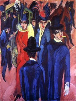
Having admired the raw energy of Kirchner’s many Berlin street scenes featuring prostitutes freely mingling with men amid expressive reds, purples and blues, it was quite striking to see the artist's distinctly different route in this work. However, these famous works must be viewed in context with any exhibition on Expressionism. In Berlin Street Scene (1913-1914), the central female figures (one enrobed in lipstick red, the other a rich royal blue) are clearly sex workers (modeled by two Berlin nightclub dancers, Erna and Gerda Schilling who appear repeatedly in his work), complete with conspicuous feathered hats, bright lipstick and rouge, and sharply defined (and suggestive) V-collared garments. The two men in the foreground dressed in marbled blues are often accepted as the artist. This can be supported by the characteristic cigarette dangling from the lips and the violently rendered hand of the figure, which is reminiscent of Kirchner's treatment of the limb in Self Portrait as a Soldier (1915), perhaps an allusion to his imminent military service and eventual denunciation of the brutality of war. The color of his deep red lips mirror that of the two women, perhaps symbolizing the artists' sympathetic view of these women’s plight and all that they represent to him: disillusionment of the pre-war era; the isolation and loneliness of modernity; and a public occupation and collective anxiety over industrialization, urbanization and class difference. Direct eye contact became the means of initiating a sexual exchange in such areas and this is telling in that the male figures in the background have their eyes to the floor. However, one of the street walkers looks at the figure presumed to be Kirchner as he looks toward the right and off the canvas, perhaps soliciting another female companion positioned off to the side whom we cannot see. It has also been suggested that the piece shows a"time lapse" wherein the two figures in the foreground first illustrate Kirchner (with his back to the viewer) approaching the women but then turning his back to them and seeks the viewer in a "plea for refuge."


Heckel's Landscape in Dresden (1910) underlies the group's affinity for Dresden, with its numerous bridges, as a location of choice for their inspiration. It depicts a figure walking over the merest suggestion of a bridge, a rose-red river receding into the distance in an otherwise flattened landscape of vigorous brushstrokes and sketchy details. Perhaps a literal representation of their group, the figure walks from the structured city life (represented on the left by a row of identical buildings) and over the bridge toward a disorderly wilderness and toward the freedom of a new expression and of color and form - and, more likely, to the future.

The remainder of the show illustrated a beautiful range of subject matter, from nature/landscapes and the group's escapes from urban life (such as to the lakes of Moritzburg and the island of Fehmarn) to the indoor scenes of the artists' studios. Schmidt-Rottluff's Country House in Osterholm (1906) presented a beautifully textured work that took on a wonderful three dimensional feel and that captured the lyrical freedom of impasto paint and the possibilities of the canvas. The last room included many images of Die Brücke's favored young model, Fränzi Fehrmann, such as Heckel's infamous Girl with Doll.


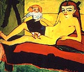
Left, Heckel's Girl with Doll (1910)
Right, Kirchner's Fränzi in Front of a Carved Chair (1910)

Here, Heckel's 9 or 10-year-old Fränzi lounges on a couch and looks out at us challengingly, her full-length nudity offset by the youthful ribbon in her hair and the child's doll that rests on her hip and conceals her genitals. However, this is not an exotic odalisque meant to incite sexual desire. The flat planes of color and the harsh, angular lines of her body reject classical representations of the female nude's long, sensuous limbs, soft curves, and carefully modeled forms. She exists as not a fantasy, but to encourage discomfort and outrage and to question the conventional bureaucracy of traditional art. The sexual nature of the work, however, cannot be ignored by the addition of a man's trousered legs that appear at the left. Kirchner's Fränzi in Front of a Carved Chair (1910) takes us to the other part of the spectrum with Fränzi in a green and red brightly patterned garment, her rouged face a sickly lime green. She stares out trustingly while the carving of the chair behind her head rises like an ominous force. Both works definitely look back at "primitive art" in its simple lines and expressive color. However, it was ultimately in the woodcut that the group found their muse. The long hallway on the third floor was devoted to the activity reports and portfolios composed by the group for their investors and other more passive members of their movement. Each one included a cover by one of the Brücke artists and contained woodcut and lithograph prints of another colleague. It is in this medium that embodied the startlingly raw nature of their craft, their avant garde intentions and their ultimate vehicle for expression.

Wednesday, April 15, 2009

Weird Beauty


Paolo Roversi, Blue Mask, Paris 2007, Another Magazine

Weird Beauty: Fashion Photography Now, currently on view through May at the International Center of Photography, offers a dizzying crash-course on contemporary fashion photography - and an unrelentingly barrage to the eye and the senses. Divided into fourteen sections, the exhibit is presented in a floor-to-ceiling format of mounted, unframed prints and magazine tearsheets from well-known fashion magazines, as well as more obscure foreign publications. Offering up a visual overload of photographic candy, the sections are more a hodgepodge of images rather than a cohesive representation of distinct stories or subthemes. Given the limited amount of exhibition space, some prints were mounted near the top of the walls making for many a sore neck - and making it very difficult to make out the images properly. Although the curatorial decisions were questionable, it presents a tantalizing glimpse into the changing medium of fashion photography as it own genre, distinct from the separate entities of fashion and photography but also the product of the merging of the two influences.

Historically, modern fashion and art has always applauded the weird, which would encompass not the conventional acceptance of beauty, but alternative views of it: the eccentric, the avant-garde, the quirky, the awkward, the slightly off-beat and off-center world that turns to underground influences of music, art, politics and discourse. Some images in the exhibition did not appear to fit within the realm of weird beauty, such as the commercial Victoria and David Beckham spread, Steven Meisel’s pretty pastel makeup editorial or the tame In the Bedroom series that showed women in undergarments posing provocatively on a bed, displaying a detached boredom that is already commonplace in fashion photography. Richard Prince's magazine cover collaboration with W in November 2007 also seemed out of place in the exhibit. The All The Best series were ten unique “signed” covers, featuring paparazzi shots of celebrities who have been the subject of much gossip magazine fodder, such as Katie Holmes, Madonna, Lindsay Lohan, Britney Spears and Angelina Jolie, the last of which was included in the show. More a commentary on the attempt to reconcile high art and popular culture, as well as a criticism of the commercialization of art and fashion, it does not seem to work well within the show’s theme. Shifting between the commercial and the cutting-edge made for a disorienting experience, but it was a reminder that beauty is subjective and that the weird has penetrated the mainstream in fashion, as well as photography.


Miles Aldridge's Immaculee series

Despite the often confusing and apparently haphazard placement of the exhibition, it did offer some wonderful examples of the merging aesthetics of fashion and photography. The exhibit opens with a Karl Lagerfeld piece (Mademoiselle, 2008), which is a close-up portrait of (presumably) a courtesan. Her face is decorated with exaggerated pink cheeks, darkened eyebrows, and garish red lipstick hurriedly applied outside of the lip’s confines. The lace strap of her undergarment is pointedly visible beneath her blouse, suggestive of a state of undress and sexual availability. A tiara is placed upon her head, which is an indication of wealth, prestige and of the upper class – a life that this woman clearly does not lead. She lives on the outskirts of society, but there is an appealing, otherworldly quality to such outcasts that make them relatable in their differences.

In addition, if considered next to Miles Aldridge’s Immaculee photographic story (Numero, May 2007) shown later in the exhibit, which plays on art historical depictions of the Virgin Mary complete with a head piece, the “tiara” can also be understood as a halo. Lagerfeld’s head piece, however, appears almost garish next to the elaborate gold spiked headdress (perhaps even alluding to Christ’s crown of thorns) featured in Aldridge’s work. Aldridge’s use of matte, pale and minimal makeup gives the figures a waxy or plastic appearance, as if they were manufactured icons. These figures have tears on their faces or eyes directed upward, perhaps indicating the distress and grief of the Pieta. However, the vacant stares and strangely odd parted mouths of these women turn them into modern Virgin Marys with more of a story – and secrets - to tell. Both Lagerfeld and Aldridge focus on the face and not so much the clothing to be advertised, thereby depending on the potent content of the images to resonate with the viewer. The fashion presented appears secondary to the story and images, but this plays onto modern fashion photography’s artistic and often cheeky use of art and history to complement and elevate the garments to art itself.


Tim Walker's Alice Gibb and Olga Sherer, Sennowe Park, Norfolk, England, November 2007

The sense of otherworldliness continues with Tim Walker’s work, Alice Gibb and Olga Sherer, Sennowe Park, Norfolk, England (November 2007; shown above). The series is perhaps best characterized by an image of two impossibly tall, slim, long-limbed, unearthly figures standing on a platform like ancient Greek statues. The sparse white platform and background, and the pure white lighting intensify the allure of these unearthly figures. The one on the right dons a filmy, transparent white layered garment and stockings, with the sheerest hint of a female body beneath. The frothy, tulle pouf-like garment on the left that appears to glow from within coupled with the awkward twig-like effect of her unnaturally thin arms and legs, is a purely ethereal image of unattainable beauty. The forms do not even cast shadows on the floor, with the only suggestion of depth found in the folds of the garments and the shadows on their legs that only further delineate and emphasize their unnaturally long limbs. The figure on the left is propped up by posts at the leg and arm while the second figure is supported by the wall and a hand outstretched to the hip of her companion. Despite this suggestion of weight, their sheer attire and abundance of white in the shot lends a sense of unnatural weightlessness, which further makes these “women” even more unattainable.


Steven Klein's Le Goût des Robes, Vogue Paris

Steven Klein’s vibrant editorial, Le Goût des Robes, Vogue Paris (October 2007) pairs richly ornate patterned and beaded Versace and Dior gowns against the backdrop of an ordinary, conventional supermarket. Using a grocery store as a location with bored and wealthy housewives has been captured before, but Klein’s uncanny juxtapositions of color and pattern provides a rather striking play on the eye. In particular, one of the images features woman dressed in a royal blue Louis Vuitton patterned dress with a draped, beaded yoke and sleeves over pink floral tights. She is splayed out across a grocery shopping cart, her legs slightly parted in a suggestively sexual manner and placed next to a display of various neatly packaged meats, the parallel of woman as an object (or a piece of meat to be devoured) are unmistakable. The contrast of high class glamour and the women’s societal position (evident by the perfectly coiffed hair, carefully selected jewelry and expensive clothing) and the everyday market immediately tells us that this is not a part of our common reality. The figures’ unearthly paleness and disengaged gazes, as well as the high contrast manipulation of the photograph’s colors lend it an unnatural feel, further distancing the image from general norms. In addition, the first photograph shows two women entering the market against a backdrop of colorful bottled drinks, with the “Do Not Enter” sign at the sliding door just visible beyond them. This sign suggests that the women are above conventional behavior and thought. They are prone to disregarding rules, but do follow a subversive understanding of reality that is beyond the common individual. This detail may also be directed to the viewer, telling us that we as ordinary individuals are not allowed access into this exclusive world.


Cindy Sherman, Merci Cindy

Any fashion photography exhibit could not be considered complete without the addition of Cindy Sherman’s works. Featured in the show is Merci Cindy (Vogue Paris, August 2007) that shows Sherman in several guises, all middle-aged women in what can be assumed to be a nightclub or bar. The first image provides a jarring contrast of a short dark-haired woman, her advanced age feebly masked by smudged, overdone eyeliner, over-plucked eyebrows, and bright lipstick paired with dark lipliner, which all serve as reminders of her aging and fading beauty. The optic patterned dress and the neon fur collar of her patterned coat is fit for someone much younger, also signifying denial of her age. Another image features another with a bobbed haircut, complete with oversized, Peggy-Guggenheim-approved eyeglasses and yet another woman wearing a revealing patterned dress with perfectly done nails, her hand pointing to herself and her eyes directed at the viewer beseechingly. All of the images emphasize the defined creases around her lips and face that belie the use of makeup, which is inexpertly applied and caked-on, and appear a tad shade off. She appears available and eager to interact with others, but her attempts to revive her youth are much too obvious and sad to be welcoming to others. The addition of this spread provides a sympathetic look at the protagonist and shows a woman reclaiming her former youth as being beautiful. However, as this exhibition has shown, it is not the conventional image of beauty that we know, but the beauty found in art – the beauty of history, of outcasts and the depraved or emotionally unstable, and of that which is found outside of the confines of our own realities so that we may see ourselves within them. That is, a greater truth of what constitutes beauty.